Staying Safe Online: For the Older Generation
Week 10: Evaluating accessible design
Task 1: Evaluating the accessibility of chosen websites
I have used Pudding.cool frequently throughout my research and creation of my project portfolio, therefore it makes sense that I evaulate it against accessibility standards.
Tool 1: WAVE Web Accessibility Evaluation Tool
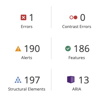
I inputted Pudding.cool inside the WAVE Tool it resulted in a plethora of interesting results (below). Notably, the results indicated 0 contrast errors, suggesting that the colour pallette for the website is carefully crafted to be as readable as possible for individuals. However, it is apparent that the images used within the Pudding.cool website use the same or very similar alternative text. This is inaccessible for visually empaired users, as they navigate the internet with audio descriptors, and would also be inaccessible by those with devices without the capacity to display these images properly; such as dated phones or computers.
Tool 2: WebAIM Contrast Checker
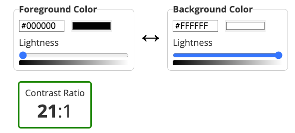
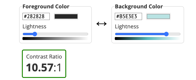
This tool, sees the use of imputting hex codes from the chosen website of the foreground and background colour combinations, and it determines if the contrast is suitable. I collected 2 different screenshots from the website and put them through the WebAIM Contrast Checker this resulted in the results (below) the main page had a perfect 21:1 contrast ratio; which makes sense seeing as it was white on black. The second screenshot I took had a good ratio of 10:1, which is still very accessible and readable to most users.
Tool 3: Readability Test Tool
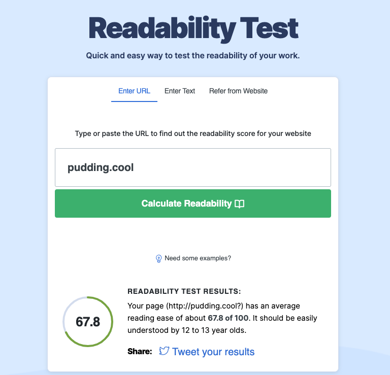
The last tool I used was the Readability test, in which you simply enter the URL and it results in an overall readability score based on the language. For Pudding.cool resulted in a score of 67.8, indicating that it should be easily understood by 12 to 13 year olds and above. This makes sense with the subjct matter of the website, as its purpose is to inform the reader on a plethora of different topics, and it is assumed that some general education would be required to make use of the website and learn from its topics.
Reflection
Overall, I'd consider Pudding.cool to be incredible accessible for its target audience. The website offers steep contrast within its design; allowing it to be easily readable. The content of the webpage is readable to those with some form of education, as it deals with educational subject matter. For areas of improvement, the website could do more to tag its images correctly, as this would prove inaccesible to those using screen readers. It is very good that the website contains little contrast issues; which is a prominant problem in website development (out of 43 million webpages, 83.6% of them had contrast issues according to WebAIM).
In terms of my webpage, due to my subject content I do plan on making my website as accessible as possible, I need to do this by employing a accessible colour pallette and by making my text readible. I could also properly tag my media content such as images and videos, to make the content accessible to those with screenreaders.
Task 2: Creating Captions
Reflecting on accessibility
Alt-tags for Images:
Key Point: As older individuals may have varying levels of visual impairment, incorporating descriptive alt-tags for images is crucial for conveying information effectively.
Practical Plans:
- Assign meaningful alt-text to images, providing clear and concise descriptions of visuals related to internet safety tips.
- Use alt-text to describe icons, infographics, or relevant images conveying important safety information.
- Refer to resources on creating accessible alt-text for guidance, considering older users' specific needs and preferences, such as 'The art of ALT: toward a more accessible Web' and 'https://napier-repository.worktribe.com/output/242180/alt-text-and-basic-accessibility'.
Semantic HTML:
Key Point: Older individuals may use assistive technologies, so structuring content with semantic HTML helps convey the intended meaning effectively.
Practical Plans:
- Using semantic HTML5 elements to structure content makes it easier for screen readers and other assistive devices to interpret the information.
- Clearly label navigation menus, articles, and other sections using appropriate semantic elements to enhance navigation.
- Provide well-organized and structured content with headings and subheadings to facilitate easy comprehension.
- Regularly test the website with screen readers to identify and address any potential accessibility issues.
Transcripts and Closed Captions for Multimedia:
Key Point: Considering that some older individuals may have hearing impairments, providing transcripts and closed captions for multimedia content ensures accessibility.
Practical Plans:
- Create written transcripts for audio content, allowing older users to access the information without relying solely on auditory cues.
- Incorporate closed captions for video content, ensuring that safety advice is accessible to those with hearing impairments.
- Choose a video player that supports closed captions and offers user-friendly controls for adjusting caption settings.
- Regularly review and update transcripts and closed captions to maintain accuracy and relevance.